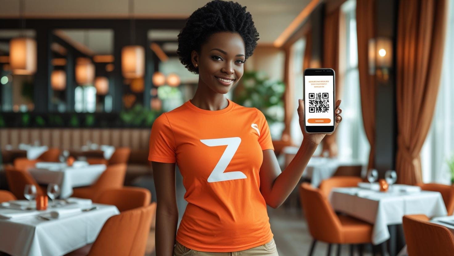
Creating an effective restaurant QR menu requires more than just listing your dishes. It's about understanding design psychology, user experience, and strategic layout principles that can significantly impact your sales and customer satisfaction.
Understanding Menu Design Psychology
Menu design psychology is the foundation of creating effective digital menus. Understanding how customers read and process information can help you design menus that guide their choices and maximize your revenue potential.
Layout Principles for Maximum Impact
The layout of your QR menu should follow proven design principles that enhance readability and guide customer attention. Start with a clear hierarchy that leads customers through your menu in a logical, profitable sequence.
Design Principle:
Use the "Golden Triangle" principle - place your most profitable items in the top-left, center, and bottom-right areas where customers naturally look first.
Color Psychology in Menu Design
Colors have a profound psychological impact on customer behavior. Understanding color psychology can help you create menus that evoke the right emotions and encourage specific actions from your customers.
Warm Colors (Red, Orange, Yellow)
Warm colors stimulate appetite and create urgency. Red is particularly effective for highlighting special offers or premium items, while orange conveys energy and excitement. Use these colors strategically to draw attention to high-margin items.
Cool Colors (Blue, Green, Purple)
Cool colors create a sense of calm and trust. Blue is excellent for seafood or premium items, while green suggests freshness and health. Purple conveys luxury and sophistication, perfect for upscale dining experiences.
Typography and Readability
Typography plays a crucial role in menu readability and user experience. Choose fonts that are easy to read on mobile devices while maintaining your brand personality.
Font Selection Guidelines
- Headings: Use bold, distinctive fonts for section headers
- Body Text: Choose clean, readable fonts for descriptions
- Prices: Use bold fonts to make pricing clear and prominent
- Special Items: Consider italic or decorative fonts for featured dishes
Visual Hierarchy and Information Architecture
Creating a clear visual hierarchy helps customers navigate your menu efficiently and find what they're looking for quickly. Organize information in a way that guides the eye naturally through your offerings.
Information Organization
Group related items together and use consistent formatting for similar types of information. For example, all appetizers should follow the same format, all main courses should have consistent structure, and so on.
Image Quality and Presentation
High-quality food photography is essential for digital menus. Professional images can increase order values by up to 30% and help customers make informed decisions about their meal choices.
Photography Best Practices
- Use natural lighting to showcase food authentically
- Style dishes to look appetizing and professional
- Maintain consistent image sizes and aspect ratios
- Include close-up shots that highlight key ingredients
Mobile-First Design Considerations
Since customers will primarily view your QR menu on mobile devices, mobile-first design is crucial. Ensure your menu is optimized for touch interaction and small screens.
Mobile Optimization Tips
- Use large, touch-friendly buttons and links
- Ensure text is readable without zooming
- Optimize images for fast loading on mobile networks
- Test navigation on various screen sizes
Call-to-Action Optimization
Effective call-to-action buttons can significantly improve your conversion rates. Design buttons that are visually prominent and use action-oriented language that encourages ordering.
CTA Design Principles
- Use contrasting colors to make buttons stand out
- Include action words like "Order Now," "Add to Cart," or "Book Table"
- Make buttons large enough for easy tapping
- Position CTAs strategically throughout the menu
Branding and Consistency
Your QR menu should reflect your restaurant's brand identity and maintain consistency with your overall marketing materials. This creates a cohesive customer experience and reinforces brand recognition.
Branding Elements
- Use your brand colors consistently throughout the menu
- Include your logo in strategic locations
- Maintain your brand voice in descriptions
- Ensure visual consistency with your physical location
Performance and Loading Speed
Fast loading times are crucial for customer satisfaction. Optimize your menu for speed without compromising on quality or functionality.
Speed Optimization Techniques
- Compress images without losing quality
- Minimize unnecessary animations or effects
- Use efficient coding practices
- Test loading times on various devices and networks
Conclusion
Effective restaurant QR menu design combines psychology, aesthetics, and functionality to create an engaging customer experience that drives sales. By implementing these design principles, you can create menus that not only look great but also significantly impact your bottom line.
Ready to Design Your Perfect Restaurant QR Menu?
Let ZOTOPRO's design experts create a stunning, conversion-optimized QR menu that perfectly represents your restaurant and drives sales growth.
